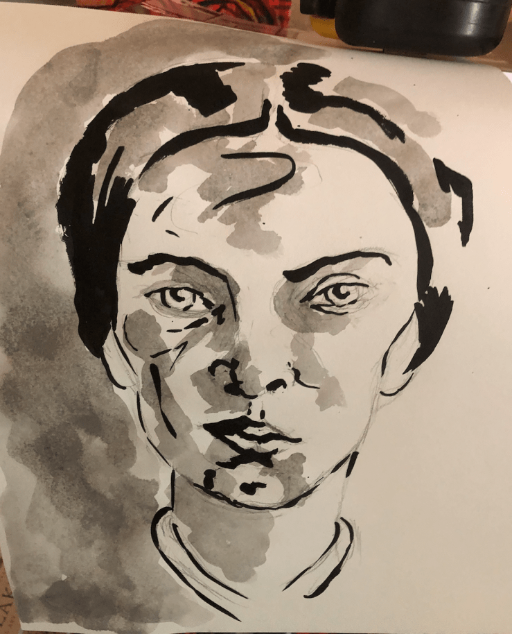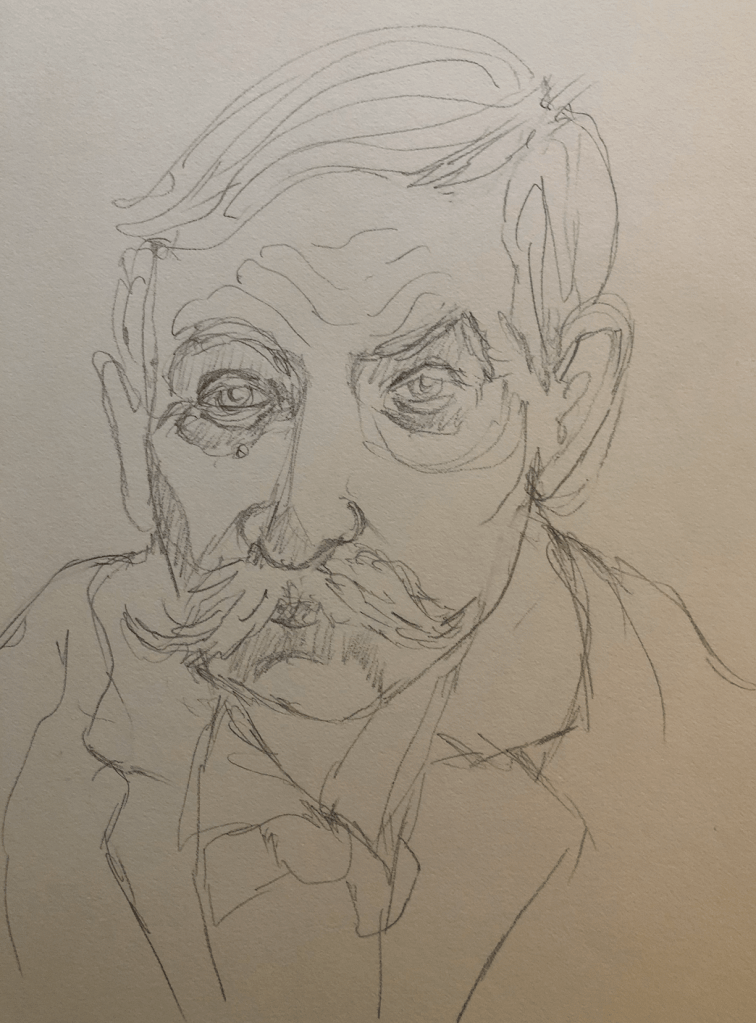
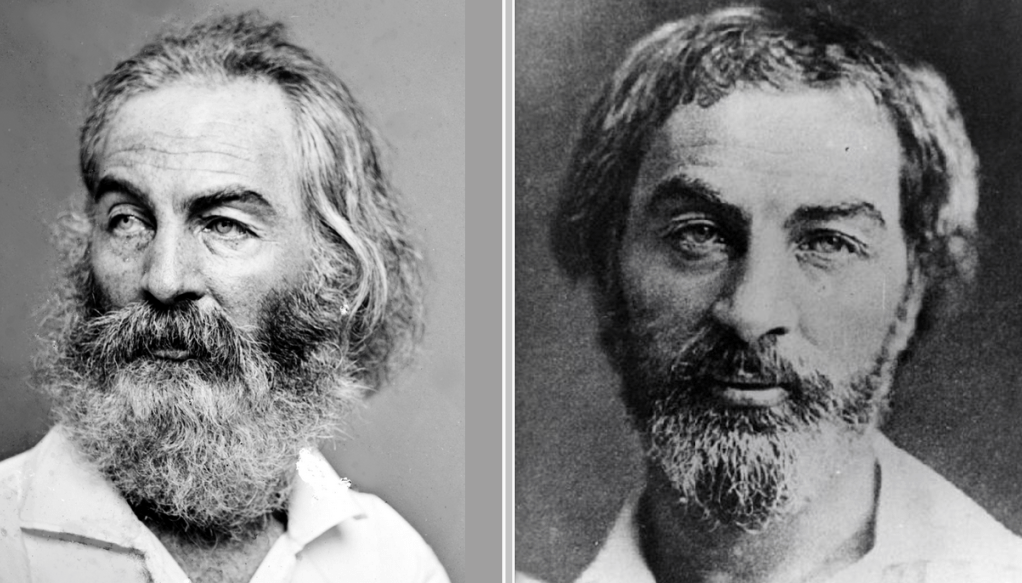
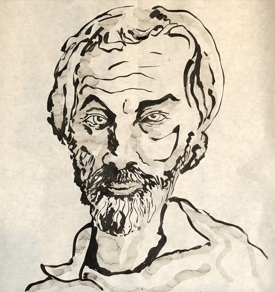

“Walt Whitman, 1854” is based on a daguerreotype portrait that was probably used to model the face of Whitman for the iconic, illustrated frontispiece of Leaves of Grass in 1855. It’s my favorite photograph of Whitman because it does not conform to the grandpa Walt archetype. My rendering of this daguerreotype tells the story of the terror of working with india ink, as well as its pleasures. Terror: the undiluted shadow on the side of his nose; I doubted if I should continue after that error. Pleasure: the pointed shape on the cheek, a spontaneous, and unplanned arc of ink that I could not make so well if I had planned it beforehand. For me, working with ink is about letting it do what it wants, to not force it. The pleasure of this kind of work is some unpredictability. “Walt Whitman, 1860s” is based on a Matthew Brady photograph that was probably taken in 1862 or 1863. I generally struggle with capturing a likeness of the bearded Whitman but beard textures and shadows are fun to explore with ink.
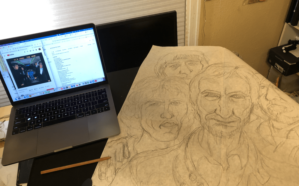
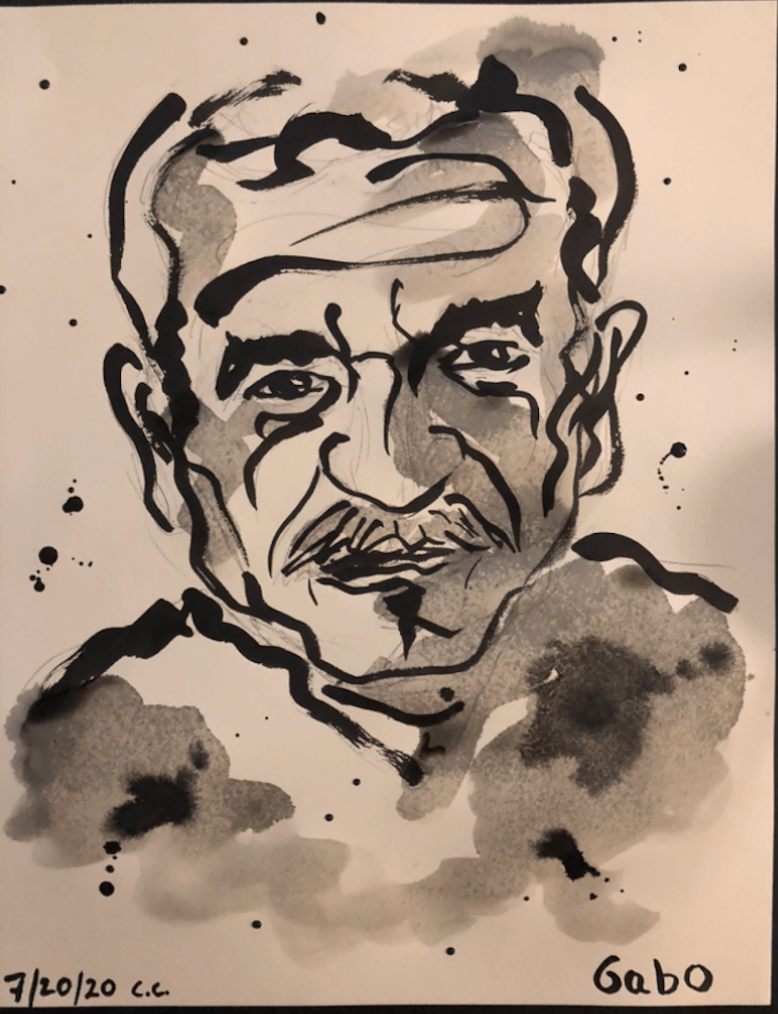
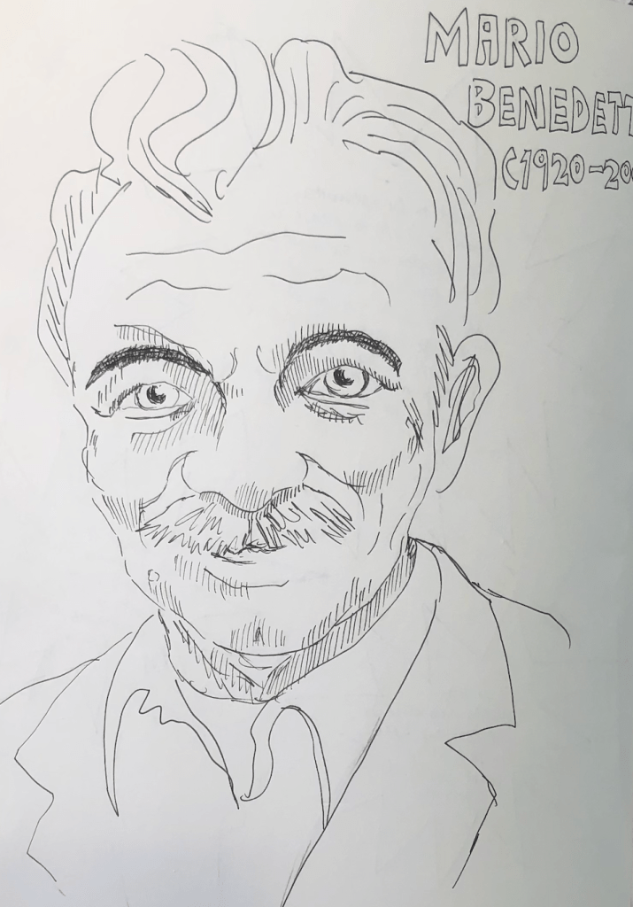
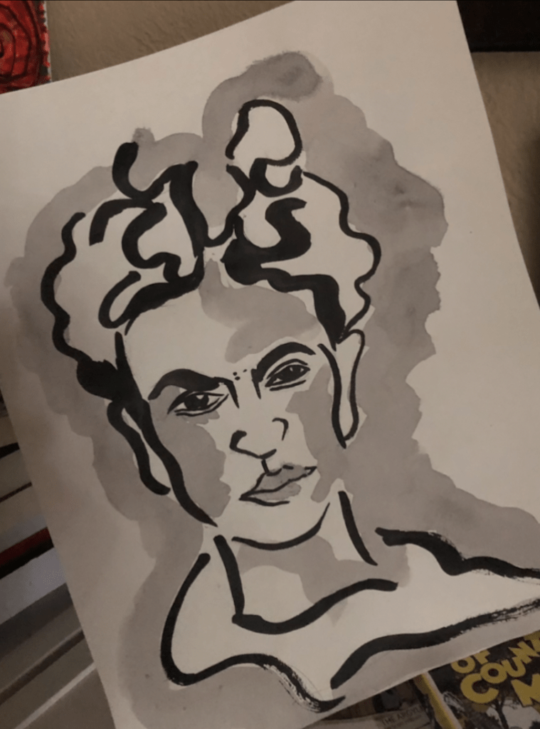
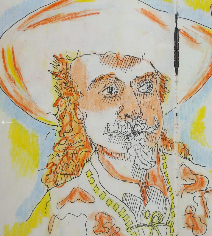
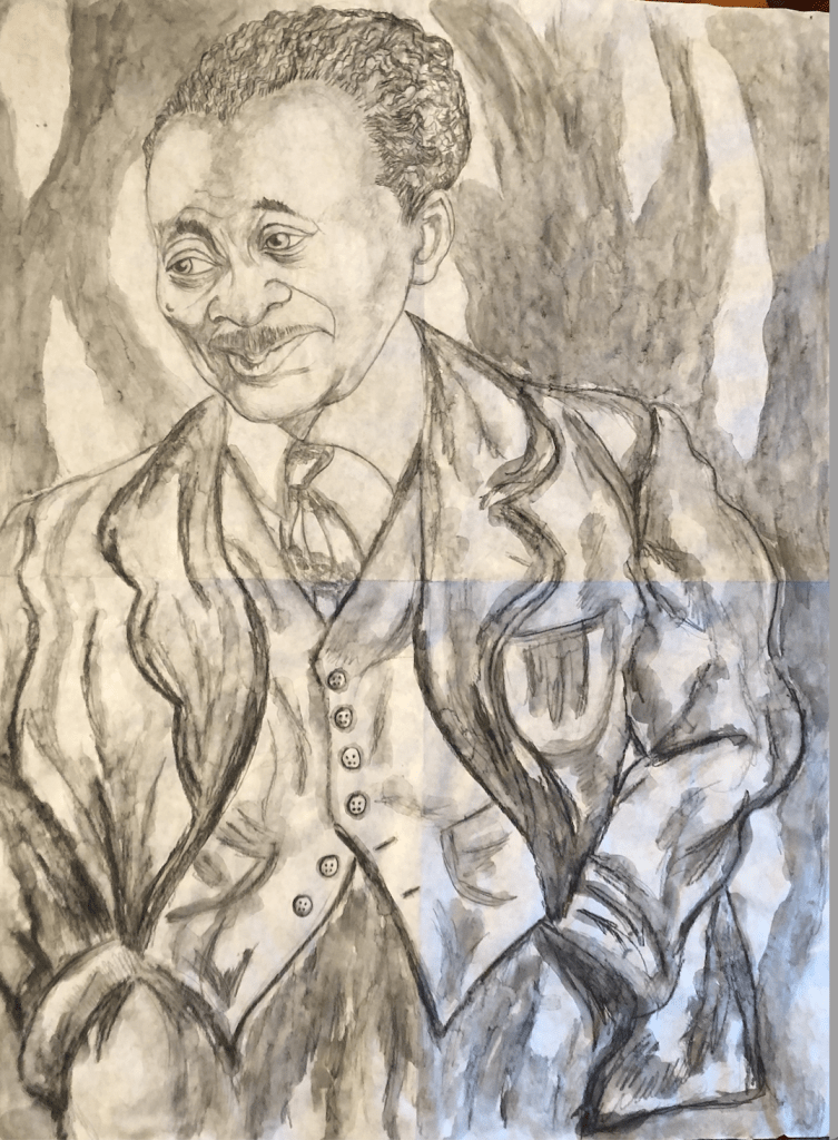
The rest of my posted pictures here.